Hey Tinkas,
Tinkatolli has made a major update to the game. They have updated the whole navigation design, changing the icons and locations of many buttons, such as the map, messages, bag, and more! They also have made a small update the the login screen.
Here is the new login screen:
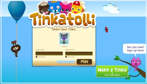
You can see from the picture that they have updated the page with the new Tinkatolli logo. They also have updated the Tips section with new icons and more tips.
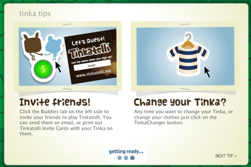
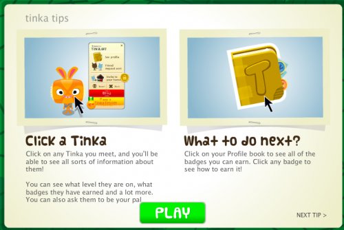
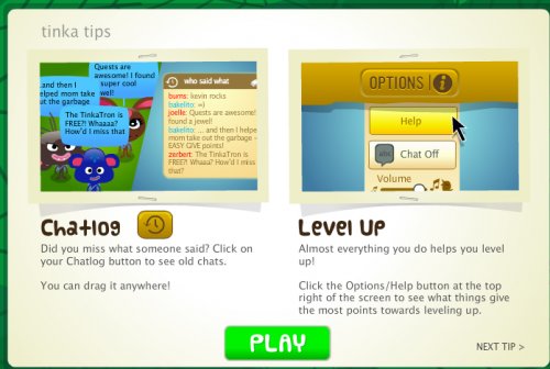
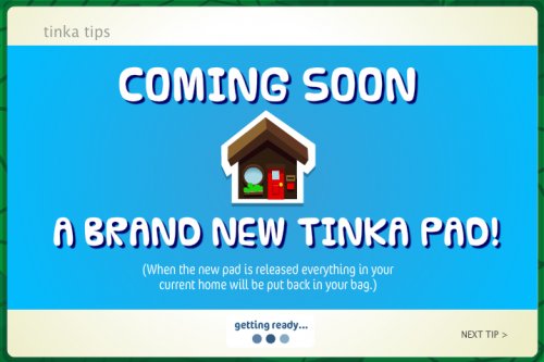
Along with the tips, there is also a slide that says there will be a all new pad design soon!
As noted above, Tinkatolli has updated their navigation design.
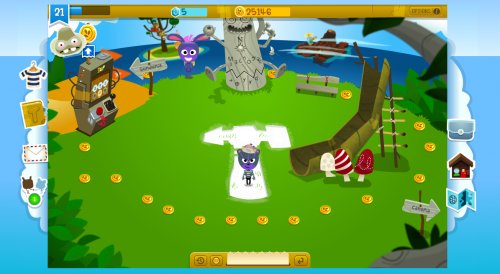
As you can see in the picture, the whole look of navigation bars has been changed! Many of the icons have changed too, giving them a much more stylish look.
 Left navigation bar

Right navigation bar
![]()
Top navigation bar
![]()
Chat bar
If you click a Tinka, you can see that the icons have been updated there, too.
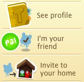
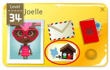
Also, you can now visit anyone’s pad (as long as they are on your friends list) without them asking you first! Just click your friends list, and click the “See [tinka’s name] Tinka Pad” button on their mini friends list playercard.
 Awesome updates! These updates definitely make it look much more sleek and easy to navigate! Do you like the new look? Are you excited for the new pad? Comment below!


